No-logs promise
We built our entire system around it, and you can be sure that we have no logs to raid and no data to hand over.
Connection without borders.
Go Far. Be Local.
250,000+ people connected — and we don’t know who they are
7 days free, then $11.99 a month
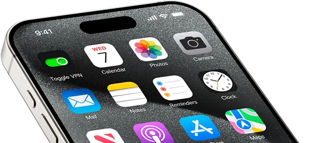
Easy to use VPN — no setup required
No logs — we never track your activity
24/7 customer support
Key benefits
Toggle VPN is your friendly guide to a simpler, faster, safer, completely open internet. We built it for everyday explorers who just want the internet to work — quick, private, without borders. It’s privacy that feels easy.
No limitations on Netflix, Reddit, X, and more. Unblock all your favorite platforms.

Stream, game, work. No slowdowns or buffering and with built-in ad blocker.

Our client code lives on GitHub for everyone to see. We’re all about transparency.

Get help anytime, instantly. We’re always here.

No passwords, no usernames. Your online activity is never tracked or stored.
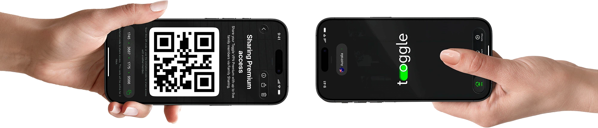
Share your Premium subscription with up to five family members through Family Sharing.
Protect your phone, laptop, tablet, and more, all at once.

Keep your family connected
Share real freedom online with up to five people you love. Family Sharing keeps them covered in just a single tap. Simple, friendly protection that keeps up with the pace of your life. Stay open to the world together.
Protection
Our security features are designed for absolute peace of mind.
We built our entire system around it, and you can be sure that we have no logs to raid and no data to hand over.
Enjoy cleaner pages, faster load times, and less data usage while browsing with AntiTracker that blocks annoying ads.
Fast, cutting-edge protocols like WireGuard and Shadowsocks for a perfect balance of speed and security, ensuring data is always protected.
All your browsing and messages are secured with ChaCha20, a modern 256-bit algorithm that's better than traditional options, especially for phones and tablets.

Your web requests stay private thanks to Toggle's own DNS servers, all the data transferred is enclosed in a secure tunnel. Your internet provider won't know what you're up to.

Toggle's split tunneling feature lets you decide! Pick which apps use the VPN and which don't. It's your call.
Our client code is available for public auditing on GitHub. Anyone can check it, anyone can contribute. We keep things honest.
Quick start
Start your journey to a freer internet. We handle the complicated stuff, you enjoy the open, friendlier web. Be local, belong anywhere.
Subscribe to the Toggle VPN plan. Try all features for free for 7 days.
1-Month Plan
$11.99 per month
Download VPN app, install, done. Takes seconds.
Just hit the Toggle button to get started. We’ll generate a unique Security Code that pops up on your screen and goes straight to the email you provided.
Our customer service is ready to help you 24/7 with every process you need a hand with.
Unlock your online life
We designed VPN features to match how you actually use the web.
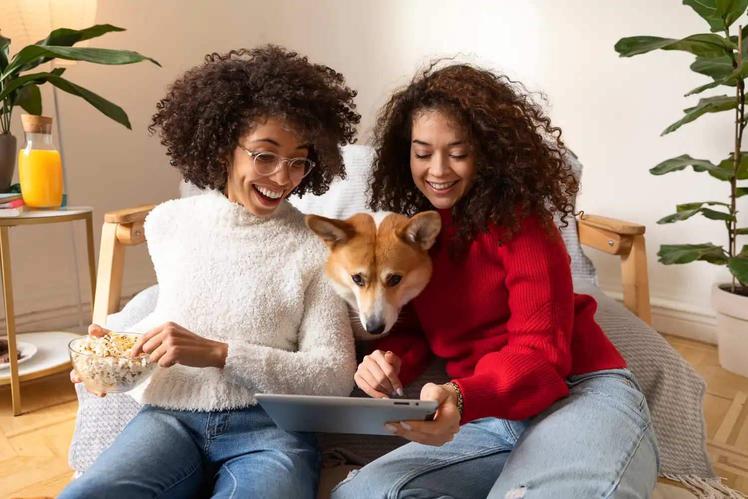
Never miss an episode. Enjoy buffer-free streaming of your favorite shows, live sports, and major platforms like Netflix, Disney+, Hulu, as well as many more.
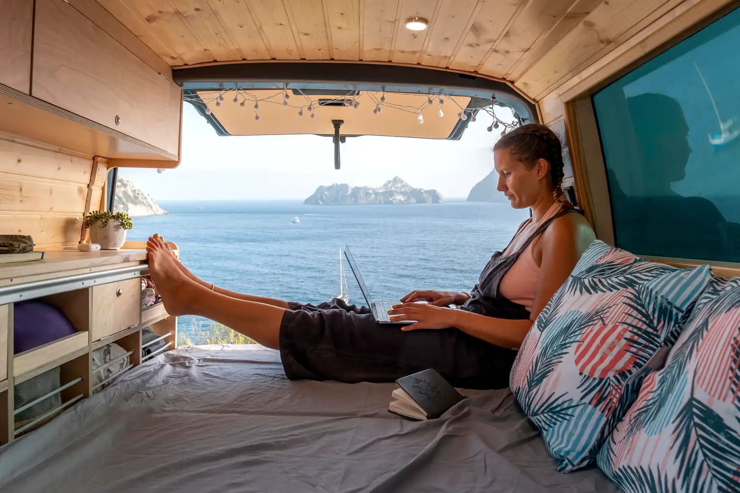
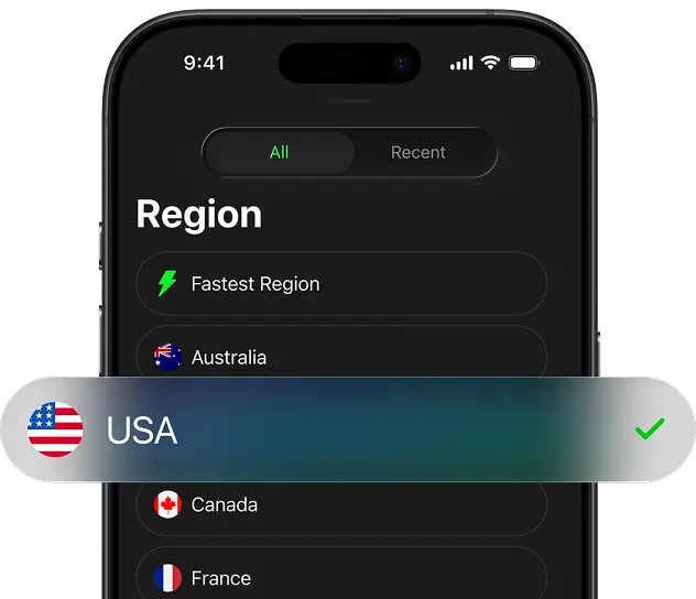
Handle banking, scroll socials, use your favorite home apps while you’re abroad. Simply select another server from the list of available countries and don’t let geo-restrictions ruin your trip.
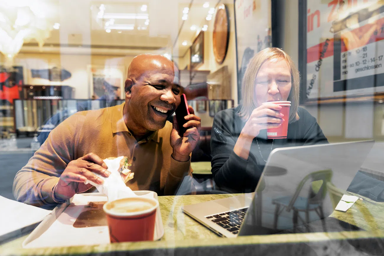
VPN connection shields your data in cafes, airports, hotels — anywhere the Wi-Fi’s sketchy. Your connection runs through our secure servers, so hackers can’t get near your passwords, bank details, or emails.

We secure every connection, allowing you to focus on work without worrying about cyberattacks or sensitive information being leaked.
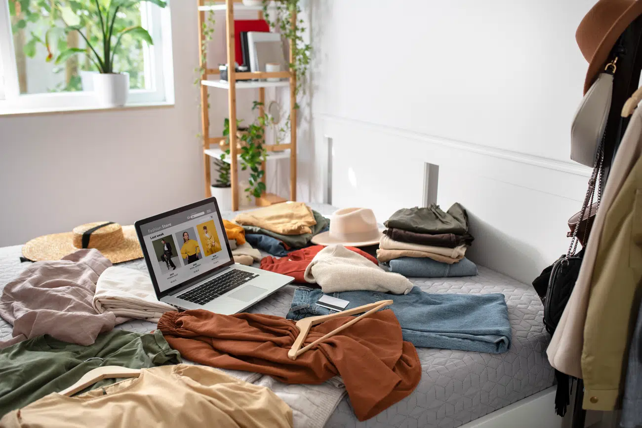
Switch your virtual location to access regional sales as well as better deals available only for specific regions.
We hide your IP address. Advertisers, tech giants, even your ISP can’t follow you around.

Use VoIP apps like WhatsApp or Teams to make secure calls and overcome restrictions to stay in touch even overseas.

Enjoy fast, stable connections, low ping, and DDoS protection. Perfect for gaming, streaming, and anything else that needs speed.
Get the VPN app
One account covers up to ten gadgets. With Toggle VPN, you just sign in and protect your laptop, tablet, and phone, all at once.
 x 10
x 10Residential access
Using our VPN, pick a spot on the map to browse like a local.
Our real residential IP addresses help you blend in perfectly, letting you use your home-country accounts overseas, enjoy smoother streaming, trusted logins, and fewer digital barriers, no matter where your exploration takes you.
Trusted by thousands
Rated for speed, ranked for simplicity, loved for freedom. Thousands of users put their trust in us.
4.8 stars
in app stores250,000+
downloads1,100+
reviews"Toggle lets me watch my home country’s Netflix with zero hassle, it’s that simple"
"A VPN that actually works with my streaming apps. No buffering, no weird blocks. Just does the job."
"These ultra-fast servers really make a difference. Streaming and gaming actually feel smooth"
"i use this quick vpn its real good and so fast like wow before i was scared in internet but now its all safe and hidden i watch all the things and no one sees what i do its so simple just one button"
"Setup was incredibly fast. Connected in under a minute. I feel more safe on public Wi-Fi now."
"Toggle was a life-saver during my last business trip. I could access all my work files and use WhatsApp without any problems. Highly recommend."
"At last a VPN that actually delivers. Ideal feature for both remote work and gaming."
"its not costing much money, i told all my friends ,they got it too and we all happy .its the best thing for internet, no problems just works good for everyone"
"Safe, high-speed, well-resourced. Hands-down the best privacy-centered VPN I've used so far."
"One account covers my whole family on 10 devices. This private vpn allows me to relax, knowing I have a secure connection."
"Browsing is truly anonymous. Support team is fantastic, making it the easiest VPN service to set up and use."
"Super responsive, secure VPN — lets me play on foreign servers without lag."
"my toggle vpn is best thing for me i using it one month it so fast and protec me good i can see what i want nobody knowing"
Go global
We run more than 1,200 servers, handpicked for speed and rock-solid reliability.
We don’t log your personal data, so your privacy stays intact while your bandwidth stays fast. Our network keeps growing, which means more options and flexibility for you.
Canada
France
USA
Germany
Austria
Netherlands
Australia
Singapore
United Kingdom
Switzerland
Toggle VPN on
Think of Toggle as a friendly teleportation device for your online life. It helps you jump over digital fences and explore worldwide internet freely.
Whether you're looking for better streaming libraries, avoiding region blocks, or just using your home-country accounts overseas, our service is here for you.
We offer a 30-day money-back guarantee
FAQ
Can't find an answer? Get in touch with us.
VPN (Virtual Private Network) operates as an encrypted conduit for your internet traffic. It wraps your data in a secure tunnel, hiding your online moves from internet providers, keeping you safe on public Wi-Fi, and letting you reach content from anywhere. So if you like privacy and freedom, you’ll definitely want one.
A VPN is legal in most parts of the world, but rules are vastly different from country to country. China, Russia, Iraq, Turkmenistan, or Myanmar, among a few others, may restrict or ban VPNs. Always double-check the laws where you are before jumping in.
Pretty much anything you’ve got: Windows, Mac, iPhone, Android, Linux, routers. You can protect up to 10 devices at the same time with a single account, so you’re covered at home and on the go.
